-
If you enjoy the forum please consider supporting it by signing up for a NES Membership The benefits pay for the membership many times over.
-
Be sure to enter the NES/MFS May Giveaway ***Canik METE SFX***
You are using an out of date browser. It may not display this or other websites correctly.
You should upgrade or use an alternative browser.
You should upgrade or use an alternative browser.
THE NEW LOOK MEGA THREAD - all comments about the new version go here !
- Thread starter Hillie4life
- Start date
cstockwell
NES Member
I like a lot of the features but the layout and color scheme are pretty awful in my opinion. What would be great is of you offered say 3 or 4 themes for the users to be able to choose from in their CP as most boards do.
edin508
NES Member
I like a lot of the features but the layout and color scheme are pretty awful in my opinion. What would be great is of you offered say 3 or 4 themes for the users to be able to choose from in their CP as most boards do.
Bingo!
I wish I could stay logged like before..")
AMEN!
I wish I could stay logged like before..
Click on the little box under the log in area... I think it says "remember me" or something... that should fix that
namedpipes
NES Member
I guessing that either the previous version is no longer supported or the new version offers new and wonderful features.
I'm not a huge fan of the color scheme / theme as of now (6:15pm) but it is better than it was earlier. Shades of Web 2.0!
Was there a posting with new features? I sorta skipped a dozen pages of complaints.
I'm sure Derek will be vindicated in the end! (Blitz1, get your mind out of the gutter. That isn't what I meant!)
I don't like my "rank" with one green bar over my name like some recruit. I should at least be a PO3 so I can get a chevron!
The red combined with the black line separating the signatures works. The red separator for each post adds enough contrast that I can read posts fine. I knew it was a matter of time before you guys found the settings to change that stuff. I personally prefer the red of the previous layout but when you guys are done I will live with whatever you decide to go with for colors.
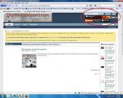
I have found one error, not sure if you guys are aware of it.
Before you login on the top right the ads sort of interfere with the login.
I am using FF 3.5.6 on Win7 Pro.
I have found one error, not sure if you guys are aware of it.
Before you login on the top right the ads sort of interfere with the login.
I am using FF 3.5.6 on Win7 Pro.
Attachments
The red combined with the black line separating the signatures works. The red separator for each post adds enough contrast that I can read posts fine. I knew it was a matter of time before you guys found the settings to change that stuff. I personally prefer the red of the previous layout but when you guys are done I will live with whatever you decide to go with for colors.
I have found one error, not sure if you guys are aware of it.
Before you login on the top right the ads sort of interfere with the login.
I am using FF 3.5.6 on Win7 Pro.
Still trying to work with the add banners.
I would have preferred a more black and evil look personally; but the look of it is not so important to me.
I was thinking the same thing. Or even a navy blue.
Last edited:
Not sure if this has been brought up. How can I find threads started by me?
Thanks.
Click on your name next to your post. "View Forum Posts"
Explain it to Corp IT.
The scores of standard compliance issues aside, IE6 is notorious as one of the least secure pieces of software ever. Any IT department that mandates it is either incompetent or is stuck with some really awful external constraints.
I think the modern web features (what the heck do they call that now? AJAX? Web 2.0?) are nice, like the attachments and such. Haven't tried the RSS yet, I think the old version supported it but it didn't update frequently enough (NES is kinda like crack in that regard..). I agree with others that some more contrast is needed. I find it hard to distinguish between forums/posts that are "new" to me and ones that have already been read.
Anyway, any upgrade will have growing pains. I'm sure with some time and constructive feedback (no whiners! we'll be all set soon enough. Thanks for all the work being put in on this!
Anyway, any upgrade will have growing pains. I'm sure with some time and constructive feedback (no whiners!
we'll be all set soon enough. Thanks for all the work being put in on this!![[rofl]](/xen/styles/default/xenforo/smilies.vb/013.gif "ROFL [rofl]")
Titan
Banned
I appreciate the difficulty switching over to any new software and it is magnified tremendously by having to make the switch in real time.
I'll reserve final judgement until the dust settles, but I'm sure everything will work out.
Many thanks to Derek and his whole team for all the work they've done and WILL DO to get everything squared away!
BTW - I tried the 'CTL+' option to enlarge the text and it makes it more readable, but the site flows over the right border of my screen (no longer fits). I use IE7.
Click on your name next to your post. "View Forum Posts"
That just brings me to what I posted on other threads. Anyway I can see threads I started. Or am I just doing it wrong?
This will definitely take some getting used to. It's not just that it's new and different...I'm finding it actually hard to look around and find things and browsing thread titles is tougher. I'm sure it will just take some time to get used to and in the end it will be well worth it for the upgrades.
That just brings me to what I posted on other threads. Anyway I can see threads I started. Or am I just doing it wrong?
Oh threads. I am looking for that too.
Kicker96FS
NES Member
Lots of work for you Derek, Thanks.
Catoperat
NES Member
It seems that if I close my browser (newest firefox) I get logged out of the forum, even if I click "remember me". With the old forum I could click my bookmark and enter the site and be logged in already. Am I missing something? I searched the the User Settings and found nothing. Just puttin' it out there....
Yeah I'll get right on that.![[wink]](/xen/styles/default/xenforo/smilies.vb/002.gif "Wink [wink]")
Hey Derek, while you are at it, can you fix windows? I am having some issues.
![[laugh]](/xen/styles/default/xenforo/smilies.vb/012.gif "Laugh [laugh]")
I appreciate the difficulty switching over to any new software and it is magnified tremendously by having to make the switch in real time.
I'll reserve final judgement until the dust settles, but I'm sure everything will work out.
Many thanks to Derek and his whole team for all the work they've done and WILL DO to get everything squared away!
BTW - I tried the 'CTL+' option to enlarge the text and it makes it more readable, but the site flows over the right border of my screen (no longer fits). I use IE7.
what is your computer screen resolution set to? Set it to a higher res and I bet your IE viewing problems are resolved.
namedpipes
NES Member
Not such a great layout in 1024x768. Derek, you might try playing with your screen settings before finalizing...
Share:
Similar threads
- Replies
- 91
- Views
- 1K
- Replies
- 5
- Views
- 354