My only issue is a preference for date and time posted to be at the top of the post (near the avatar) vs. being at the bottom. It is, however, inconsequential and I’ll probably stop noticing it in a couple weeks. I’m fine with color schemes.
-
If you enjoy the forum please consider supporting it by signing up for a NES Membership The benefits pay for the membership many times over.
You are using an out of date browser. It may not display this or other websites correctly.
You should upgrade or use an alternative browser.
You should upgrade or use an alternative browser.
I used to love this Forum
- Thread starter Wendell
- Start date
the login screen is not set up the same as the old format so my saved passwords wouldn't load properly, took me 3 days to find my stupid current login password. (yea, I know I could have reset it)
There, now that's off my chest.
The adjustment period will just take a little time. I've been on other forums and had screen shots saved, and they did a major format change, after a while got use to it then went back to reference a saved page and remarked how antiquated/outdated the old paged looked.
After some time I bet i wont even remember how the old forum was set up.")
There, now that's off my chest.
The adjustment period will just take a little time. I've been on other forums and had screen shots saved, and they did a major format change, after a while got use to it then went back to reference a saved page and remarked how antiquated/outdated the old paged looked.
After some time I bet i wont even remember how the old forum was set up.
There are some fairly simple CSS tweaks that I think would make a huge difference....
1) Remove all gradients from the button, banners, menu, etc.
2) Remove drop shadows from text....drop shadow on top of gradient backgrounds makes text very hard to read.
3) Text is too small....back in 1994 we used 11px fonts because people had small monitors....text is generally too small.
4) Pick a more readable font...try Roboto...its very nice for reading.
5) Round buttons with drop shadow and gradients....just too much web 2.0 look going on there.
Rockrivr1
NES Member
ETA: in a perfect world everyone would be able to pick their own scheme for viewing the forum... but I don't think thats easy to pull off....
-Mike
Over at The High Road they made it so you can choose one of three different color options. I hated the default, but one of the alternates was fairly decent. If they could do that here I think many would choose their own favorite.
but this new software 'upgrade' is making it difficult to read.
The thing is, NES used to be beautiful.
I know...nobody cares what Wendell thinks...and the owner of NES will do whatever he wants, etc...but I've seen a lot of different forums, over the years, completely ruined by a software 'upgrade'. More annoyance, fewer people, fewer posts, leading to a dead forum.
I'm not optimistic.
I agree. it's f*cking awful.
Rockrivr1
NES Member
Marines have been saying that long before that shitty movie came out. And Jarheads hate that flick. Yeah right, there was a Recon platoon in the suck that F***ed off until Clint Eastwood was assigned to square them away. Everything about that movie was wrong from a platoon of Recon Marines who didn't PT, to a bozo who almost shot a major on a rifle range with a nd. I know it is a movie, but Marines look at it like an insult to the Corps.
Marines have Heartbreak Ridge, Navy has Top Gun, Air Force has Iron Eagle and the Army has too many to list......
hiker45acp
NES Member
Been trying to get used to it, example; just seems that you don't call a classified ad a "classified ad", you call it "contents" when I am looking for any sell ads I posted, point is call it what it is and the site would be easier to navigate! And if the forum is a work in progress, why hasn't there been any changes yet for for some of the issues? The color scheme still SUCKS, looks like a sewing club forum. Sure you might say suck it up or get used it, stop whining etc........why should I, I don't settle for second best, if your not part of the solution than you are part of the problem. Would like to see some of the issues resolved. As long as others keep pointing out the issues than more work needs to be done...sooner would be better than later.
namedpipes
NES Member
I think the scheme improvements from when everything was first upgraded are pretty dramatic. I find it hard to believe people have
difficulty reading it at this point. There's other minor whines I have but the scheme isn't too bad...
ETA: in a perfect world everyone would be able to pick their own scheme for viewing the forum... but I don't think thats easy to pull off....
-Mike
I'm about in the same place. My biggest beef is wanting a (real) mobile solution with a (very) dark theme.
Still, sHORTY and Admin actually, pretty much pulled it off. The first few days were horrifying. The css tweaks quickly made the site bearable. It doesn't feel as homey as the old site, but hell.
I will admit the new site does not "stick out" quite as much on my screen at work. I open up Outlook and display an email, then superimpose NES over the reading pane and it looks very much like an email that I'm reading. (with avatars blocked, of course)
ISOTOX
NES Member
- Joined
- Feb 20, 2008
- Messages
- 8,261
- Likes
- 5,332
someone put wendell on suicide watch, please.
Nah let him jump....
ISOTOX
NES Member
- Joined
- Feb 20, 2008
- Messages
- 8,261
- Likes
- 5,332
You mean they are out? Dam no wonder all they funny looks....
Say what....
namedpipes
NES Member
what
I'm about in the same place. My biggest beef is wanting a (real) mobile solution with a (very) dark theme.
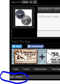
There's some thoroughly broken stuff, but I put up a TEST dark color scheme. You can select it in the very bottom left corner of any page.
I'll go through and make it usable tomorrow.
Edit: I made it a ton better.
Last edited:
If you want to test out the new theme, click here:

@namedpipes @drumenigma @connor @minininjer
First few people I found asking about a dark theme.
@namedpipes @drumenigma @connor @minininjer
First few people I found asking about a dark theme.
Attachments
Last edited:
If you want to test out the new theme, click here:
View attachment 215480
@namedpipes @drumenigma @connor @minininjer
First few people I found asking about a dark theme.
Thanks for continuing to tinker; if you’re looking for feedback on the darker theme, I’m not a fan.
Thanks for continuing to tinker; if you’re looking for feedback on the darker theme, I’m not a fan.
The darker theme will never be made default - this is for people looking for an alternative. You'll always be able to switch between them.
MachineHead
NES Member
If you want to test out the new theme, click here:
View attachment 215480
@namedpipes @drumenigma @connor @minininjer
First few people I found asking about a dark theme.
YES!!!!! Thanks, sHORTY! This just made everything better. Hopefully this option is here to stay.
Individualist
NES Member
- Joined
- Jan 24, 2009
- Messages
- 4,663
- Likes
- 4,366
I like the default style. The work that has gone into working and tweaking the new site over the past weeks has really helped quite a bit. Thanks sHORTY and crew.
roccoracer
NES Member
My only complaint is that I can no longer use tapatalk. My usage of the forum has dropped 90% because of it.
namedpipes
NES Member
There's some thoroughly broken stuff, but I put up a TEST dark color scheme. You can select it in the very bottom left corner of any page.
I'll go through and make it usable tomorrow.
Edit: I made it a ton better.
My retinas thank you!
Yes, some stuff to tweak but it does help. Reading a phone screen with the lights off is uncomfortable at best.
smokey-seven
NES Member
I think I like the new default screen. Can the forum selection screen for General, Off Topic etc. go dark as well?
Never mind. I had to logout and clear my preferences and the Forum Selection screen went dark. THANKS!
Never mind. I had to logout and clear my preferences and the Forum Selection screen went dark. THANKS!
Last edited:
Ranger007
NES Member
Did wendell hang himself yet?someone put wendell on suicide watch, please.
kevin9
NES Member
Thank you! I much prefer the dark theme.If you want to test out the new theme, click here:
View attachment 215480
@namedpipes @drumenigma @connor @minininjer
First few people I found asking about a dark theme.
The buttons on message posting pane need more contrast, as does the contrast between read and unread threads.
It would be nice to have a touch more color in places, not just shades of grey (ex. pale orange msg borders, greenish tint to unread thread titles. some color to the message posting pane buttons).
In God We Trust
NES Member
Yeah I really only surf from work now since I don’t have a PC at home. I think this is the fourth or fifth post I’ve made since the site changeover.My only complaint is that I can no longer use tapatalk. My usage of the forum has dropped 90% because of it.
I do everything through my phone and I can’t really read the site very well anymore. Plus the buttons are too small for my fat thumbs. I really miss Tapatalk.
hiker45acp
NES Member
I like the dark color scheme alternative. Thanks for your efforts.
minininjer
NES Door Greeter
If you want to test out the new theme, click here:
View attachment 215480
@namedpipes @drumenigma @connor @minininjer
First few people I found asking about a dark theme.
Soooo slow on this; I completely missed the notification alert but thanks sHORTY! My eyes are happy now. Well, maybe except for the gradient on the formatting buttons? Or is it just me?

Either way, I'm happy there's an alternative to the bleach white theme
Thanks!greencobra
NES Member
- Joined
- Jul 2, 2011
- Messages
- 27,226
- Likes
- 26,726
whoa. first time I can read the screen without glasses, nice!
EC1
NES Member
The default colors are better than the dark colors. However for my two cents compared to the lighter and smaller text of the default scheme, I'd prefer all black text with a yellow background if you need to highlight something. Something about maximizing the readability with higher contrast and colors to the middle of the vision range.
Share:
Similar threads
- Replies
- 6
- Views
- 291